Note
An online, interactive version of this example is available at Binder: ![]()
Plotting
Using Parselmouth, it is possible to use the existing Python plotting libraries – such as Matplotlib and seaborn – to make custom visualizations of the speech data and analysis results obtained by running Praat’s algorithms.
The following examples visualize an audio recording of someone saying “The north wind and the sun […]”: the_north_wind_and_the_sun.wav, extracted from a Wikipedia Commons audio file.
We start out by importing parselmouth, some common Python plotting libraries matplotlib and seaborn, and the numpy numeric library.
[1]:
import parselmouth

import numpy as np
import matplotlib.pyplot as plt
import seaborn as sns
Matplotlib is building the font cache; this may take a moment.
[2]:
sns.set() # Use seaborn's default style to make attractive graphs
plt.rcParams['figure.dpi'] = 100 # Show nicely large images in this notebook
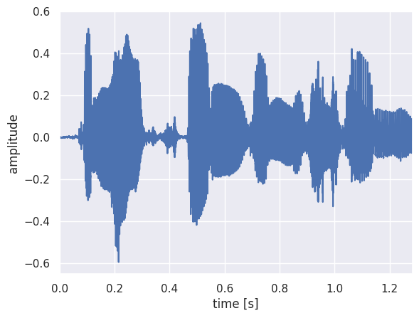
Once we have the necessary libraries for this example, we open and read in the audio file and plot the raw waveform.
[3]:
snd = parselmouth.Sound("audio/the_north_wind_and_the_sun.wav")
snd is now a Parselmouth Sound object, and we can access its values and other properties to plot them with the common matplotlib Python library:
[4]:
plt.figure()
plt.plot(snd.xs(), snd.values.T)
plt.xlim([snd.xmin, snd.xmax])
plt.xlabel("time [s]")
plt.ylabel("amplitude")
plt.show() # or plt.savefig("sound.png"), or plt.savefig("sound.pdf")
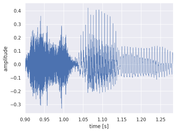
It is also possible to extract part of the speech fragment and plot it separately. For example, let’s extract the word “sun” and plot its waveform with a finer line.
[5]:
snd_part = snd.extract_part(from_time=0.9, preserve_times=True)
[6]:
plt.figure()
plt.plot(snd_part.xs(), snd_part.values.T, linewidth=0.5)
plt.xlim([snd_part.xmin, snd_part.xmax])
plt.xlabel("time [s]")
plt.ylabel("amplitude")
plt.show()
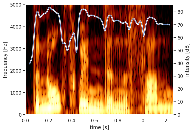
Next, we can write a couple of ordinary Python functions to plot a Parselmouth Spectrogram and Intensity.
[7]:
def draw_spectrogram(spectrogram, dynamic_range=70):
    X, Y = spectrogram.x_grid(), spectrogram.y_grid()
    sg_db = 10 * np.log10(spectrogram.values)
    plt.pcolormesh(X, Y, sg_db, vmin=sg_db.max() - dynamic_range, cmap='afmhot')
    plt.ylim([spectrogram.ymin, spectrogram.ymax])
    plt.xlabel("time [s]")
    plt.ylabel("frequency [Hz]")

def draw_intensity(intensity):
    plt.plot(intensity.xs(), intensity.values.T, linewidth=3, color='w')
    plt.plot(intensity.xs(), intensity.values.T, linewidth=1)
    plt.grid(False)
    plt.ylim(0)
    plt.ylabel("intensity [dB]")
After defining how to plot these, we use Praat (through Parselmouth) to calculate the spectrogram and intensity to actually plot the intensity curve overlaid on the spectrogram.
[8]:
intensity = snd.to_intensity()
spectrogram = snd.to_spectrogram()
plt.figure()
draw_spectrogram(spectrogram)
plt.twinx()
draw_intensity(intensity)
plt.xlim([snd.xmin, snd.xmax])
plt.show()
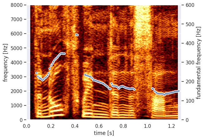
The Parselmouth functions and methods have the same arguments as the Praat commands, so we can for example also change the window size of the spectrogram analysis to get a narrow-band spectrogram. Next to that, let’s now have Praat calculate the pitch of the fragment, so we can plot it instead of the intensity.
[9]:
def draw_pitch(pitch):
    # Extract selected pitch contour, and
    # replace unvoiced samples by NaN to not plot
    pitch_values = pitch.selected_array['frequency']
    pitch_values[pitch_values==0] = np.nan
    plt.plot(pitch.xs(), pitch_values, 'o', markersize=5, color='w')
    plt.plot(pitch.xs(), pitch_values, 'o', markersize=2)
    plt.grid(False)
    plt.ylim(0, pitch.ceiling)
    plt.ylabel("fundamental frequency [Hz]")
[10]:
pitch = snd.to_pitch()
[11]:
# If desired, pre-emphasize the sound fragment before calculating the spectrogram
pre_emphasized_snd = snd.copy()
pre_emphasized_snd.pre_emphasize()
spectrogram = pre_emphasized_snd.to_spectrogram(window_length=0.03, maximum_frequency=8000)
[12]:
plt.figure()
draw_spectrogram(spectrogram)
plt.twinx()
draw_pitch(pitch)
plt.xlim([snd.xmin, snd.xmax])
plt.show()
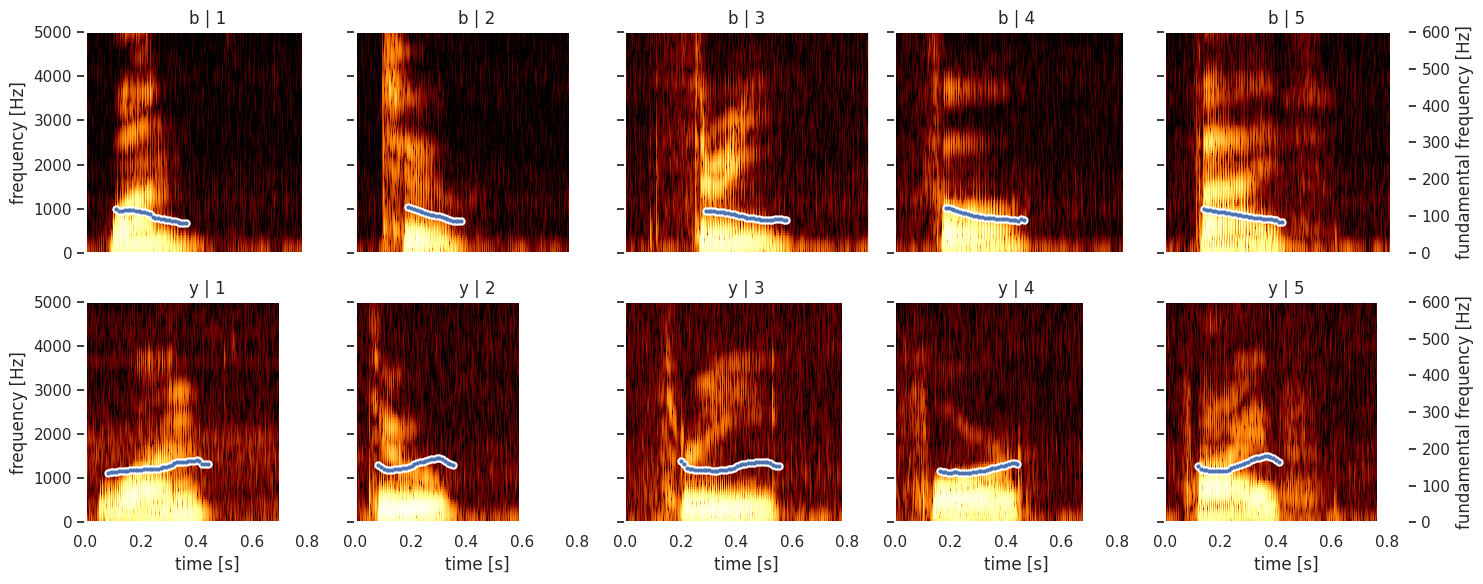
Using the FacetGrid functionality from seaborn, we can even plot plot multiple a structured grid of multiple custom spectrograms. For example, we will read a CSV file (using the pandas library) that contains the digit that was spoken, the ID of the speaker and the file name of the audio fragment: digit_list.csv, 1_b.wav,
2_b.wav, 3_b.wav, 4_b.wav, 5_b.wav, 1_y.wav, 2_y.wav, 3_y.wav, 4_y.wav, 5_y.wav
[13]:
import pandas as pd

def facet_util(data, **kwargs):
    digit, speaker_id = data[['digit', 'speaker_id']].iloc[0]
    sound = parselmouth.Sound("audio/{}_{}.wav".format(digit, speaker_id))
    draw_spectrogram(sound.to_spectrogram())
    plt.twinx()
    draw_pitch(sound.to_pitch())
    # If not the rightmost column, then clear the right side axis
    if digit != 5:
        plt.ylabel("")
        plt.yticks([])

results = pd.read_csv("other/digit_list.csv")

grid = sns.FacetGrid(results, row='speaker_id', col='digit')
grid.map_dataframe(facet_util)
grid.set_titles(col_template="{col_name}", row_template="{row_name}")
grid.set_axis_labels("time [s]", "frequency [Hz]")
grid.set(facecolor='white', xlim=(0, None))
plt.show()